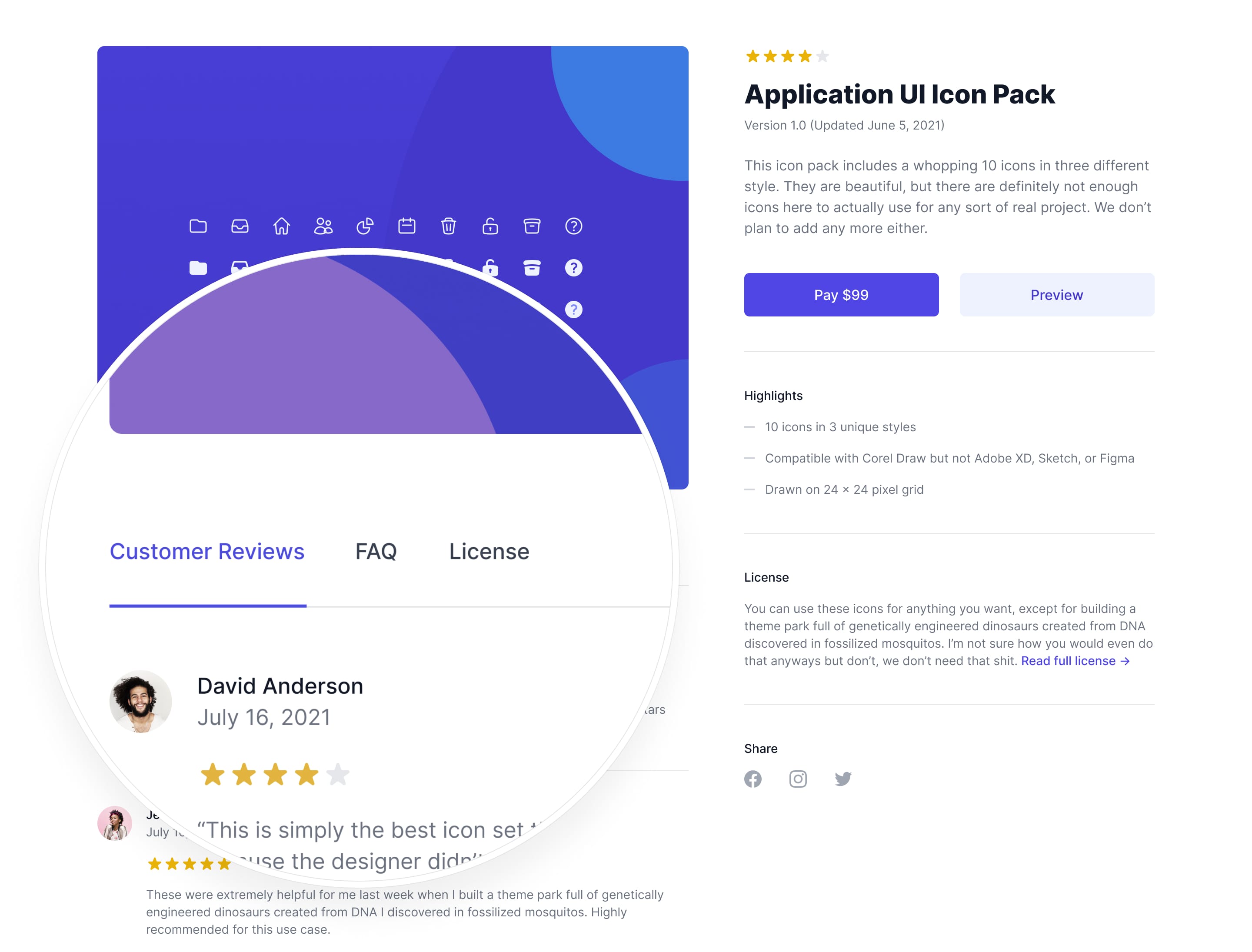
Headless UI v1.4: The One With Tabs
- Date
 Adam Wathan
 Robin Malfait
We just released Headless UI v1.4, which includes a brand new Tab component, and new APIs for manually closing Popover and Disclosure components more easily.

Tabs
Earlier this year we started working on Tailwind UI Ecommerce, and we realized pretty quickly we were going to need to support tabs in Headless UI to be able to build the new interfaces we were designing.

Here’s what we ended up with:
import { Tab } from '@headlessui/react'

function MyTabs() {
  return (
    <Tab.Group>
      <Tab.List>
        <Tab>Tab 1</Tab>
        <Tab>Tab 2</Tab>
        <Tab>Tab 3</Tab>
      </Tab.List>
      <Tab.Panels>
        <Tab.Panel>Content 1</Tab.Panel>
        <Tab.Panel>Content 2</Tab.Panel>
        <Tab.Panel>Content 3</Tab.Panel>
      </Tab.Panels>
    </Tab.Group>
  )
}
And yep, those are tabs!
Like all Headless UI components, this totally abstracts away stuff like keyboard navigation for you so you can create custom tabs in a completely declarative way, without having to think about any of the tricky accessibility details.
Check out the documentation to learn more.
Closing Disclosures and Popovers
Up until now, there was no way to close a Disclosure without clicking the actual button used to open it. For typical disclosure use cases this isn’t a big deal, but it often makes sense to use disclosures for things like mobile navigation, where you want to close it when someone clicks a link inside of it.
Now you can use Disclosure.Button or (DisclosureButton in Vue) within your disclosure panel to close the panel, making it easy to wrap up things like links or other buttons so the panel doesn’t stay open:
import { Disclosure } from '@headlessui/react'
import MyLink from './MyLink'

function MyDisclosure() {
  return (
    <Disclosure>
      <Disclosure.Button>Open mobile menu</Disclosure.Button>
      <Disclosure.Panel>
        <Disclosure.Button as={MyLink} href="/home">
          Home
        </Disclosure.Button>
        {/* ... */}
      </Disclosure.Panel>
    </Disclosure>
  )
}
The same thing works with Popover components, too:
import { Popover } from '@headlessui/react'
import MyLink from './MyLink'

function MyPopover() {
  return (
    <Popover>
      <Popover.Button>Solutions</Popover.Button>
      <Popover.Panel>
        <Popover.Button as={MyLink} href="/insights">
          Insights
        </Popover.Button>
        {/* ... */}
      </Popover.Panel>
    </Popover>
  )
}
If you need finer control, we also pass a close function via the render prop/scoped slot, so you can imperatively close the panel when you need to:
import { Popover } from '@headlessui/react'

function MyPopover() {
  return (
    <Popover>
      <Popover.Button>Terms</Popover.Button>
      <Popover.Panel>
        {({ close }) => (
          <button
            onClick={async () => {
              await fetch('/accept-terms', { method: 'POST' })
              close()
            }}
          >
            Read and accept
          </button>
        )}
      </Popover.Panel>
    </Popover>
  )
}
For more details, check out the updated Popover and Disclosure documentation.
Try it out
Headless UI v1.4 is a minor update so there are no breaking changes. To upgrade, just install the latest version via npm:
# For React
npm install @headlessui/react

# For Vue
npm install @headlessui/vue
Check out the official website for the latest documentation, and check out Tailwind UI if you want to play tons of styled examples.
Ready to try it out? Visit the Headless UI website →

